
101 Education PPT is educational software developed by NetDragon Websoft which provides a teaching library of 350,000 coursewares, images, videos, animation, audio, and exercises. Matching the content by grades, subjects, chapters and publishers, 101 PPT helps teachers easily find good content to make lessons for their classroom. 101 Education PPT works with presentation clickers, and has dedicated clients for mobile and VR devices.
Background
101 PPT mobile version connects and syncs with the Windows client to allow teachers to remotely control their slideshows via their iPhone or Android device. In addition to functioning as a remote control, it enjoys feature parity with the desktop version, with such features as login, viewing, lesson creation, downloading, editing, and basic classroom management tasks. The remote control interface also provides tools like a spotlight, magnifier, and brush to draw students attention.
Putting all these features into a mobile device, hiding complexity when possible, created unique challenges for the experience and product teams at NetDragon. Extensive user research was completed, including field visits to many schools throughout China. Research found that teachers have little time to learn new tools, and have many things competing for their attention. This required that whenever possible the app. experience must hide the complexity, while still giving teachers the control that they desired.
Problem
I was tasked with finding problems and iterating possible solutions with the mobile version. NetDragon wanted a fresh pair of eyes to iterate the current experience, and communicate these ideas via wireframes and polished interfaces (design reviews at NetDragon most often were of polished work).
As a result of interview data, previous usability test results, and my heuristic analysis I set to work on the following areas:
- Fix found issues with onboarding difficulty and confusion
- Find novel approaches to using mobile client to reduce distraction
- Increased focus on “Play” functionality
- Improve the connect to PC client flow
- Correct issues with how the “tools” were presented
The work was assigned on a Monday, started the following Wednesday and completed by the following Monday. Communication and reporting followed over the next couple of weeks.
Process
NetDragon like many companies has their own internal design process (ND calls theirs “The Checklist”), but following their extensive approach wasn’t necessary in the short time frame I had to complete this project. Generally if given the choice I follow what might be called a modified UX agile process (pictured below), with the focus, after research, a prototyping and feedback loop.

For this project I reviewed the extensive existing research, performed a comprehensive literature review and competitive analysis, did semi-structured interviews via Skype and WeChat, and analyzed the results, and finally sketched and created wireframes of new flows and screens.
Current state analysis
Whenever possible I always start any project with research that will allow me to become as close as possible to a domain expert within the product space. It’s not always possible to spend a great deal of time, nor is it always required, but when I am asked to advise or work on a product I am unfamiliar with I find it an important part of my process. This work is in addition to any formal qualitative or quantitative research that I might perform as a part of the product development process. The activities might include literature reviews, informal semi-structured interviews, expert reviews, usability testing, field visits and competitive analysis. If it’s an existing product or product category I become intimately familiar with the softwares usage and it’s community groups.
For 101PPT Mobile I did a complete literature review of current research (journals articles, videos, usability test results and etc.) focusing on a wide range of topics including ergonomics of how people use phones, how they present in front of a group of people, teachers and technology in the classroom, differences between Eastern and Western classroom management practices, how teachers teach, and usability test results of similar products.
I also reviewed the extensive user research and usability testing that was performed previously.
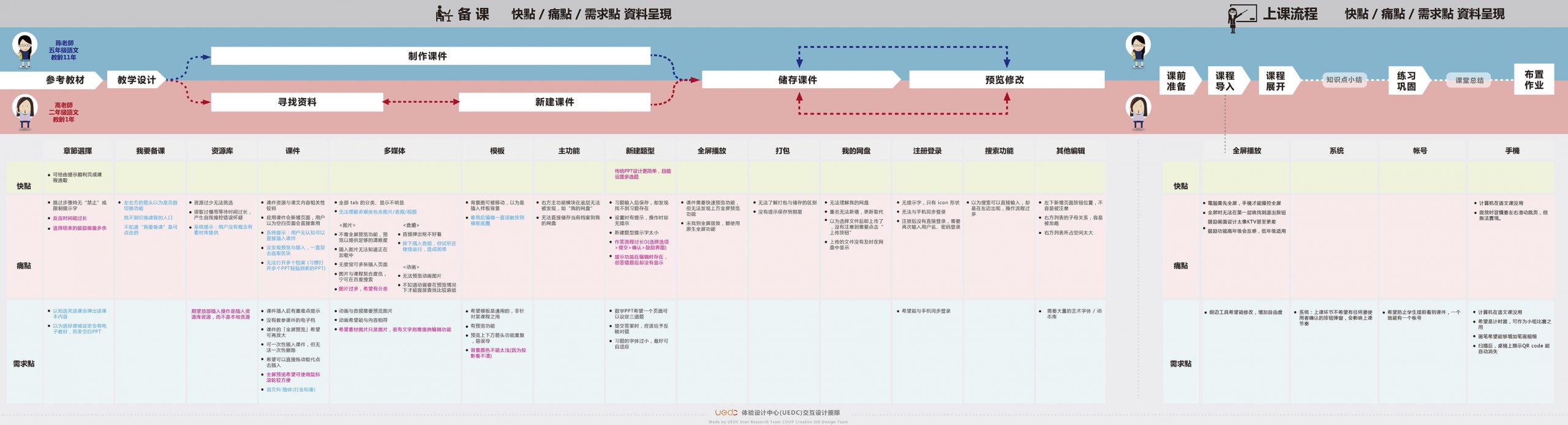
User journey map replete with pain points proved to be useful.
Heuristic analysis
Below are the results of the analysis performed with a very brief summary.

Most problems found were defined as not critical but taken together would have a negative impact on the customers perception of the product and impact the quality. These problems ranged from cut off labels in the user interface to inappropriate uses of progressive disclosure.
The most serious of the problems found had to do with the complexity of the interface itself. Of note was that the search function simply did not return results that were useful during my review. Also, the search function provided no feedback to the user, no error correction, or help.
UX Benchmarking/Competitive analysis
Competitive analysis is often misused or misunderstood in China and Taiwan. Instead of using the method to highlight strengths and weaknesses of products in order to make more informed decisions about product strategy, it is often an excuse to find apps. or UI to copy, without a deep understanding of what lead to their design decisions.

Early research completed with the team prior to this projects start illustrated how our user needs might be met with examples from competitors products.
NetDragon had one of the most comprehensive UX Benchmarking/Competitive analysis processes I have seen. With a young team it was used not just to find opportunities but as an education tool.

A simplification of analysis organized around the users concepts of various categories of tasks ( this is how others solved similar problems list).
Qualitative research
Despite having access to past user research and having reviewed hours of prerecorded observation videos I still had some unanswered questions, particularly with regards to how teachers in China prepared their lesson materials, their attitude toward the usage of technology in the classroom and how comfortable they are dividing their focus between device and students.

6 representative users are enough to find patterns or gain insight, with a spare in case something goes wrong. For this interviews I had to settle for 5 due to time constraints.
Through participation in a pre-planned focus group and some quick semi-structured interviews done via Skype and WeChat I was able to identify themes among participants and identify what direction further exploration in the app. experience might follow. I added the collected data to the pre-existing personas which I referred to through-out the product design process.
Themes:
- They did not understand the registration flow nor the need to register a device (focus group).
- They want to be able to use screen based devices, like hardware devices, by “feel”.
- They are engaged while teaching and don’t appreciate distractions.
- Beyond simple edits, they were not interested in creating content on mobile devices.
The interviews also showed that the majority of the users work time was spent engaged with students, with very little time for preparation or time to simply learn something new (the space between).

A construction of the teachers mental spaces or activities while having the possibility of using the mobile app was constructed after the interviews.
Sketches and wireframes
I do most of my visual thinking with pencil or sharpie and paper. This allows me to iterate various ideas as quickly as possible without the overhead that working with a computer provides. During this process I am also able to share my ideas with colleagues to gain feedback and markup the paper documents themselves. Also, the rough nature of early paper prototypes allows for more detailed feedback, and I find better adherence to the creation of ideas that actually fit user needs (paper requires little investment in time).
Below are some of the concepts I created to address the problems found.
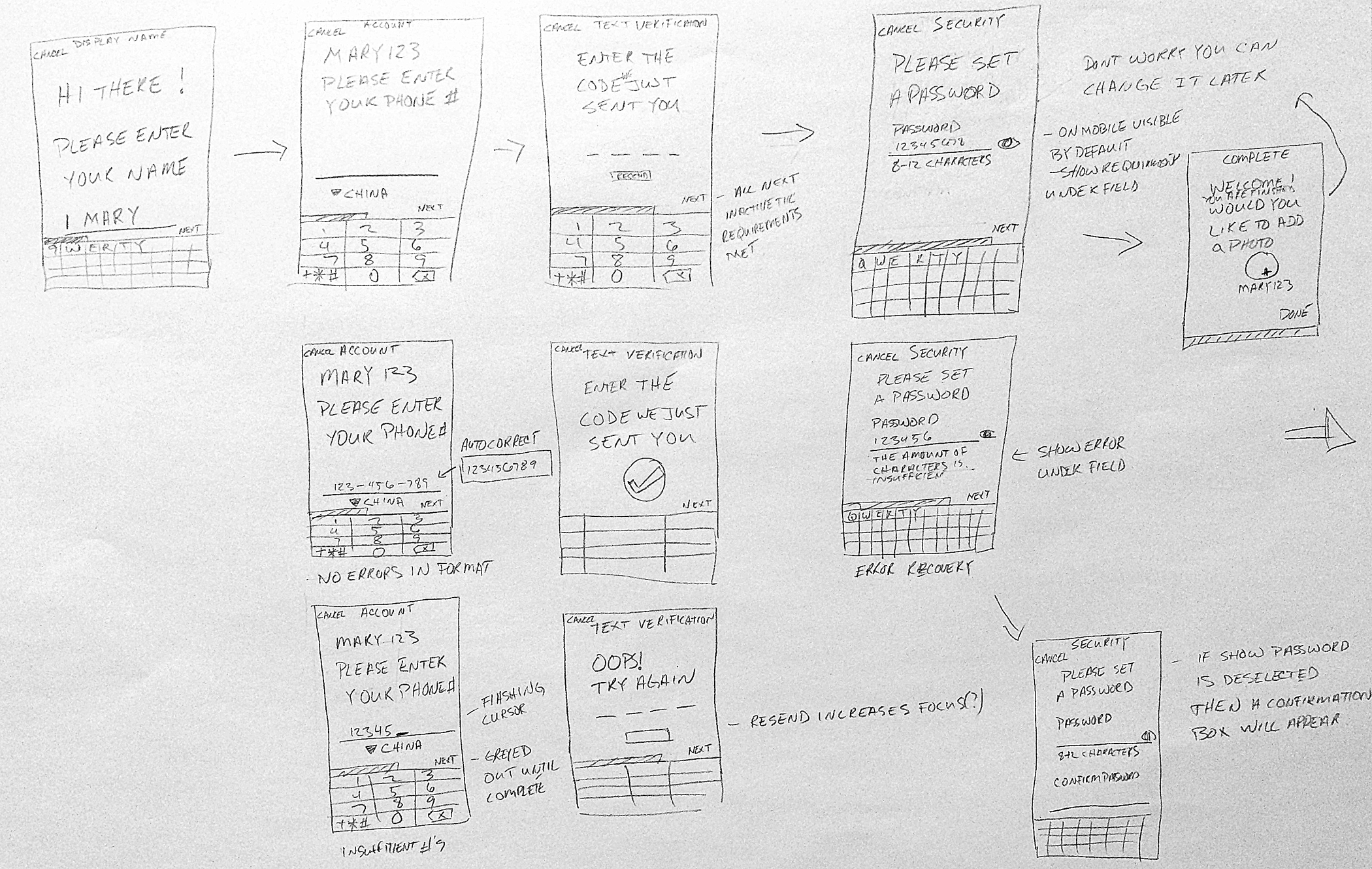
Initial sketch of what the registration flow could look like.

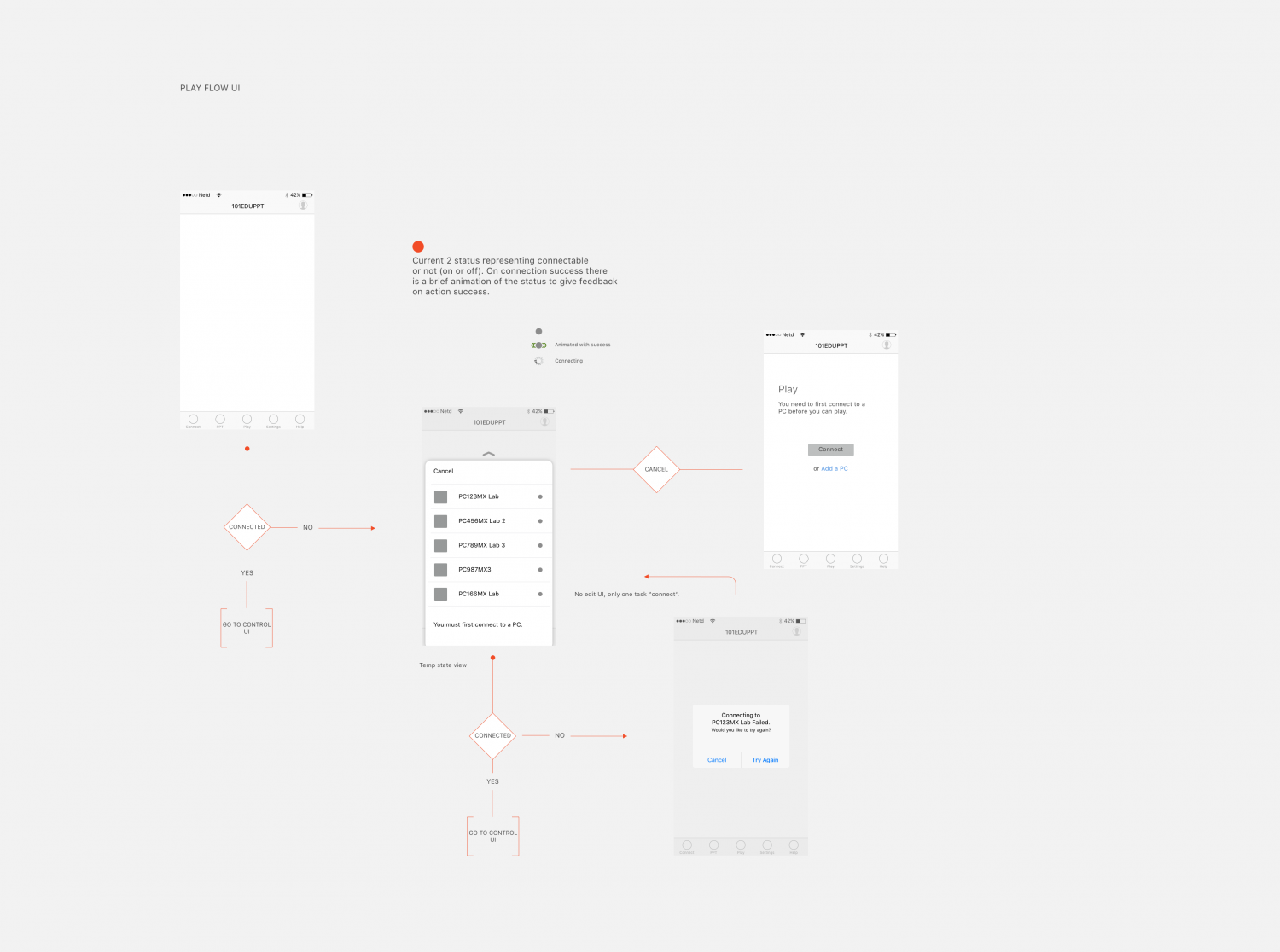
The proposed app architecture emphasized it’s usage as a remote control.
From initial pencil and paper sketches I then start creating detailed wireframes in Sketch.
Click image to view in greater detail
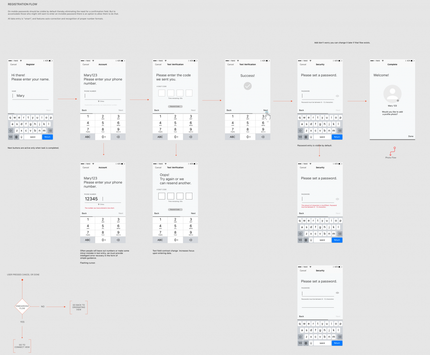
The app requires registration which users found confusing. This concept attempts to solve this problem.
On mobile passwords should be visible by default thereby eliminating the need for a confirmation field. But to
accomodate those who might still want to enter an invisible password there is an option to allow them to do that.
All data entry is “smart”, and features auto-correction and recognition of proper number formats.
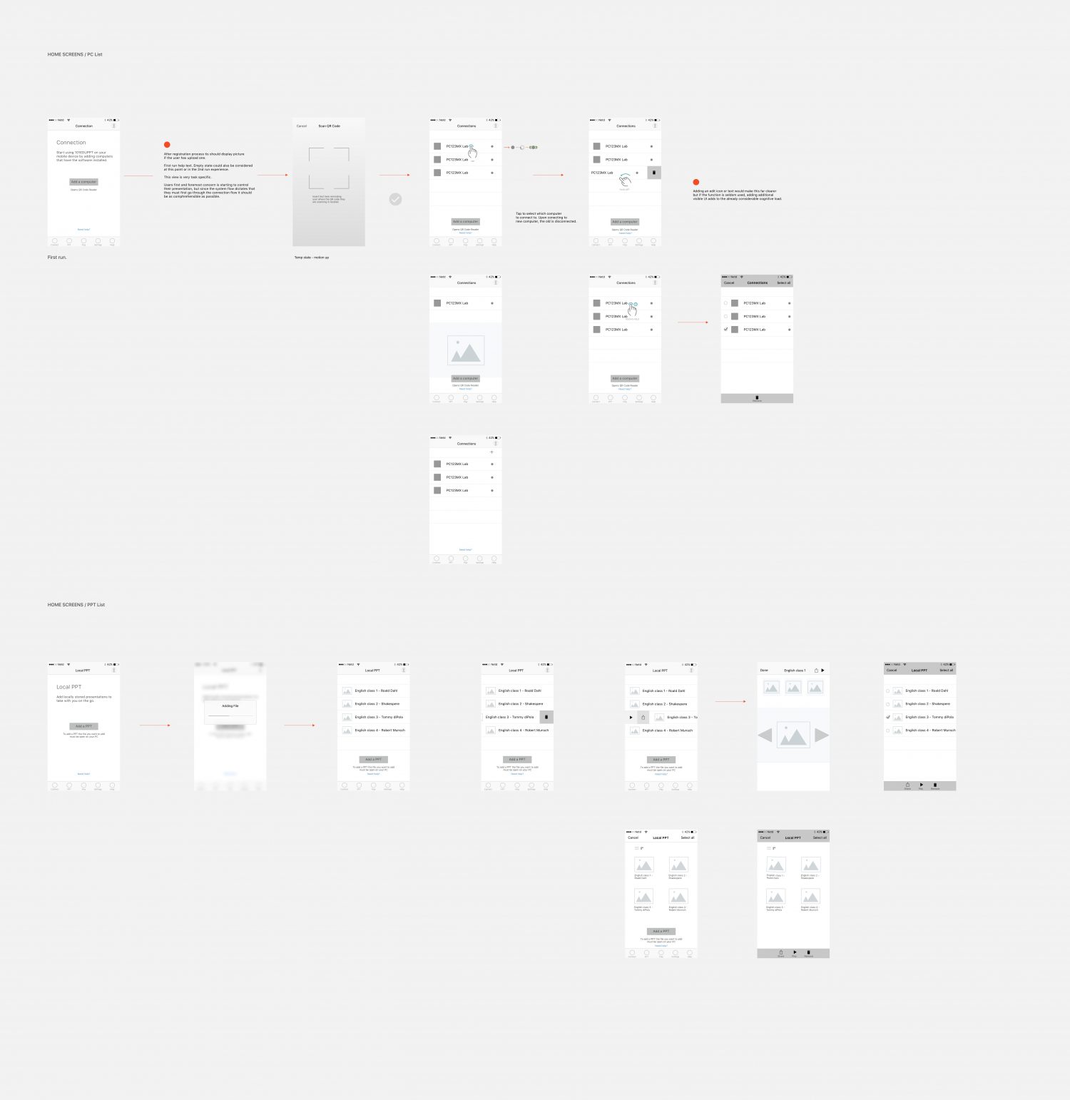
To start using 101 EDU PPT on your mobile device you need to add computers that have the software installed. This flow attempts to simplify what was a very confusing process.

Onboarding flow. Onboarding helps give users a sense of what they’ll need to do in order to get what they need from an app or product. It’s a way of building confidence and trust with your user. This concept introduces new users with a 4-screen overview. The introductory flow employs onboarding best practices such as progress dots and an obvious skip option. An alternate option gives a guided tour of the features.
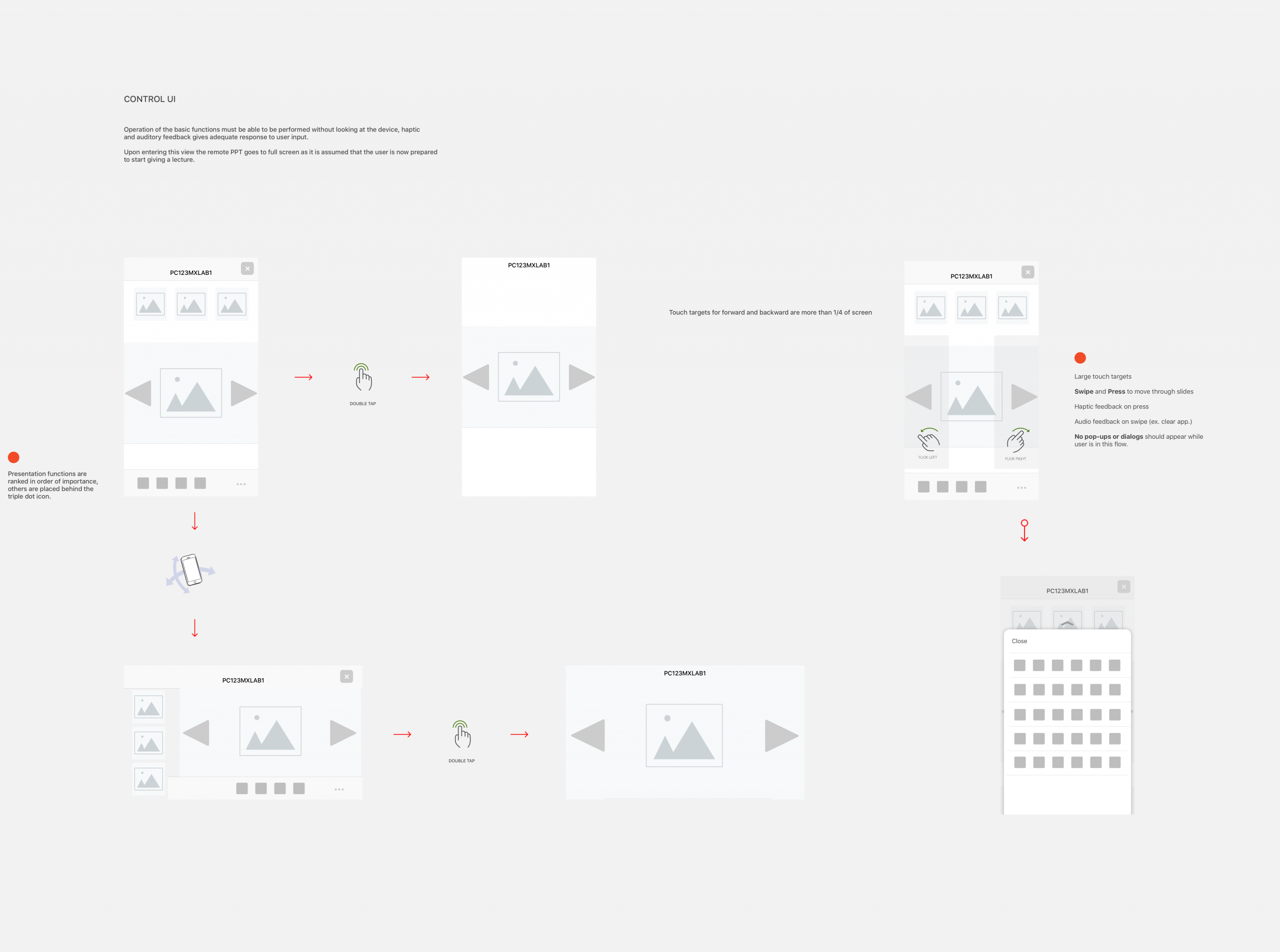
I hoped to employ haptic
and auditory feedback to provide adequate response to user input.
I made mistakes in the beginning of course. Language plays a critical role in the experience of software and my use of English did nothing to endear the ideas to other members of the team. The timeframe didn’t allow for translation and I didn’t trust my own translation abilities to create copy that didn’t distract from the ideas. Ideally the copy would have been translated, tested and iterated with the target customers.
NetDragon has a tradition that all concepts must be fully flushed out with refined user interfaces before they are presented to the Chief Designer. Unfortunately, we weren’t able to finish this part of the process but many of the ideas presented here made it into the next production version of 101PPT nonetheless.
